

According to Tim Croxson, COO of leading glass packaging company Croxsons, bottle decoration is a key part of the customer journey and one that goes far deeper than making a bottle attractive.
There was a time in the early to mid-nineties, when premium drinks companies saw potential in bottle decoration as a means of increasing shelf stand-out. As a result bottle manufacturers began to experiment with exciting effects, such as metallic sprays and thermal chromatic paints and other complex techniques. Back then much of the evolving decoration innovation from a production perspective was ahead of its time, expensive and not yet commercially viable, although some spirits brands – vodka in the main – embraced decoration to good effect as a means of creating a niche in the premium spirits market.
Since then we’ve seen decoration being used extensively with many new and exciting innovative techniques evolving en route. Typically, amongst the good there is also the bad examples of decoration, including many instances of blatant plagiarism of some of the spirits brands. Nonetheless decoration is here to stay and, with the onset of craft distilling, is likely to grow exponentially as new and seasoned brand owners compete for prominence in an increasingly crowded marketplace.
Like others in our industry, providing our customers with decoration is a component of overall offering, being a key part of our ‘customer journey’. In its provision, we find ourselves cultivating a consultative approach to our customers, who often see decoration as a ‘must have’ without necessarily fully appreciating a) the effects of decoration on the brand itself, b) the production implications of the embellishment(s), or c) the commercial viability of what they are after. Unfortunately there are frequent occasions where brands have used expensive decoration techniques to compensate for a second-rate product. Quite rightly this damages consumer confidence who feel ‘ripped-off’ having been swayed by decoration into purchasing a seemingly premium product whose experience isn’t up to the mark.
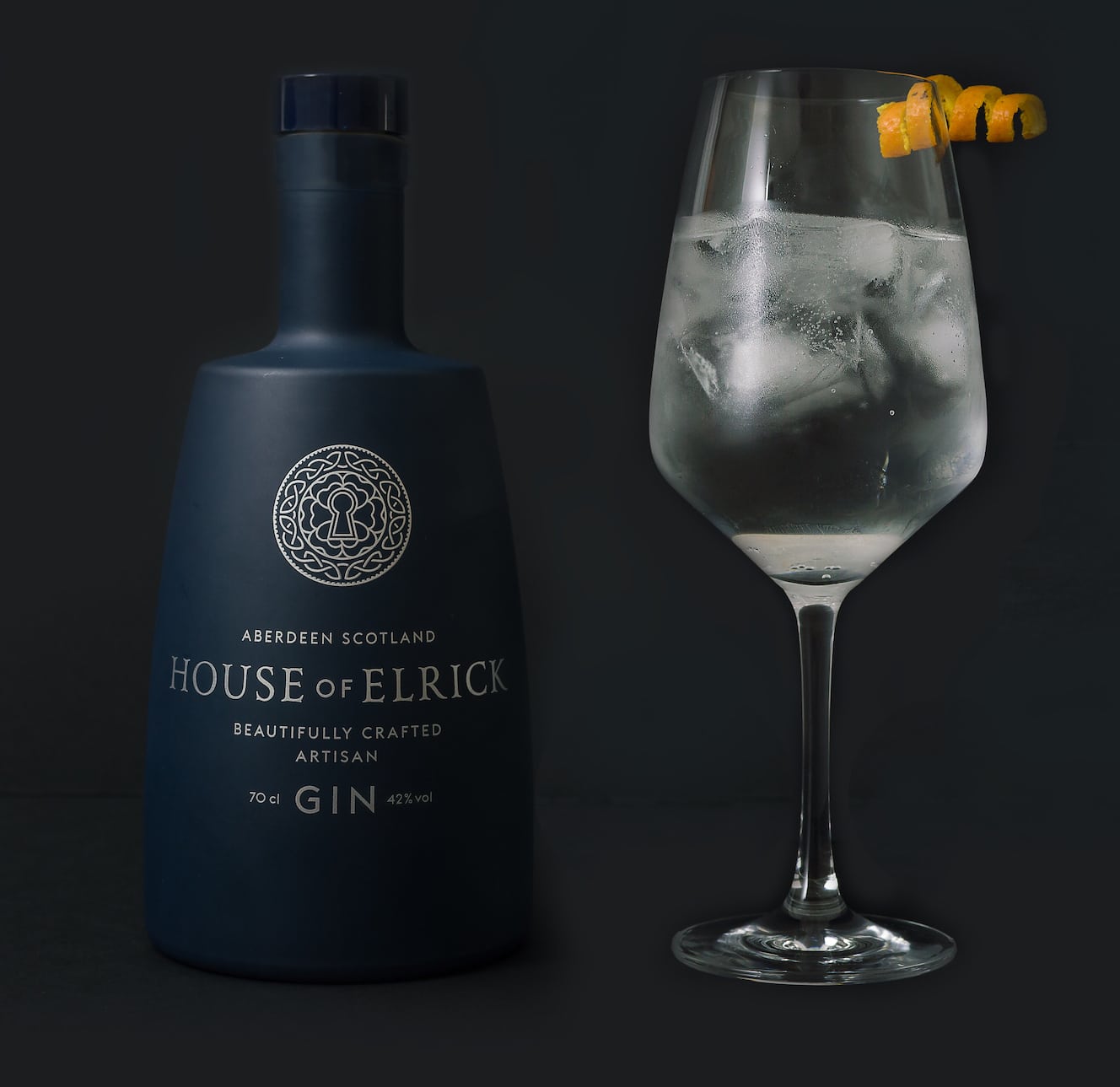
Ultimately at Croxsons, we are in the business of using our in-depth expertise and knowledge of decoration to create great looking packaging, at a price-point which is commercially sound. The collaboration and added-value we provide our customers not only affords us new opportunities, but also an excellent customer retention track record. Two good examples of this work ethic can be best demonstrated in our decoration techniques for artisan gin producers the House of Elrick (https://houseofelrick.co.uk/) and Silent Pool Distillers (http://silentpooldistillers.com/) – the former being a simple, yet impactful decoration illustration, the latter a complex story telling design that effuses provenance.
Producing just 600 bottles per batch, the House of Elrick is located on an historical estate in Aberdeenshire and is the only artisan small batch gin producer that uses fresh, filtered water straight from Loch Ness.
In creating their primary packaging, we used the luxurious look and feel of an apothecary style bottle, sprayed in a matt blue finish and screen printed with silver ink to communicate a unique and distinctive appeal. The result is both simple and bold in its execution, providing the House of Elrick with maximum shelf stand-out and delivering a final glass product that matches the brand’s exceptional liquid and heritage. Stuart Ingram, brand owner, said: “As a new entrant to the Industry, having partners in business that understand the clients requirements is key to any working relationship, Croxsons have managed to address all concerns during the course of our product development.”
As a project the House of Elrick typifies our customer journey well. It represents a meeting of minds, arriving at an affordable decoration that provides great individualisation, proving that irrespective of whether you are a large or small producer, there should be no compromise in aiming to create maximum impact on shelf.
Silent Pool Gin is produced on the Albury Estate in the Surrey Hills, right next to the Silent Pool, a beautiful, mysterious spring-fed lake. Before Silent Pool’s award winning distillery was even constructed, Ian McCulloch, founder of Silent Pool, asked for our advice with regards to packaging the end product.
The complex decoration, essentially based on Silent Pool’s incredible story, was again a result of the coming together of key parties in collaboration – Silent Pool, Croxsons and design and innovation consultants, Seymourpowell. The stunning looking blue bottle, complete with detailed copper lithography took many months of refinement to arrive at the finished spectacular design. The decoration provides a higher-level engagement, taking the consumer on a journey which is asking to be absorbed and appreciated.
Of this particular project, Ian McCulloch said: “Croxsons not only took the headache of sourcing complex packaging and decoration away, but more importantly we have ended up with a product that is outstanding. Croxsons have been the perfect partner for this project, and I look forward to working with them as the brand and distillery expands.”
Looking to the future of decoration, I firmly believe that less is more and that keeping it simple (even if the technical process is not so) will benefit brands. Even at a premium level, decoration should be used to communicate a lot more than just being a nice bottle to look at – connecting with the consumer being the motive as opposed to decoration for decorations sake. It can make a product, encouraging brand loyalty or, if done badly, get lost in the melee of ‘me-too’ ‘also ran’ brands. My plea, let’s do this right.